A LinkedIn Cover That Isn’t Stock
My LinkedIn cover is one line of math and one curve:
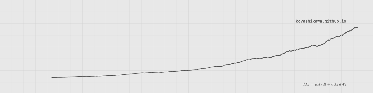
Geometric Brownian motion, the process Black-Scholes assumes for the underlying. The curve is a single realized path: exponential drift, Brownian noise. My preference is a quiet, monochrome plot in the same palette as this blog, so that’s what this is.
A few decisions were deliberate.
A cover should be ambient
A LinkedIn banner is background. People come to the profile for the bio, the experience, the work. So the cover gets three elements and nothing else: the curve, a caption, and a URL. No axes, no ticks, no gridlines inside the plot. If the values don’t matter, the scaffolding is noise. I kept the graph-paper grid from this blog’s background, because it gives the curve a sense of place without making it a chart.
Grey, not black, not blue
The data-viz literature converges on “grey plus one accent” for figures where a specific element matters. But a cover is the opposite situation: nothing in it should compete with the content below it. So the curve and caption are a mid grey, the URL is a little darker for legibility, and there is zero hue.
Text on a cover dies
The placement that survived is symmetric: URL top-right, equation bottom-right, both right-aligned to the same column. An equation is content that describes the visual, so it sits on the visual like a caption. The URL is a signature, so it sits in the corner like one. Two text elements, two jobs, no overlap.
The crispness problem
Screenshot the HTML at 1x and a 2px curve is 2 physical pixels. It comes out soft and aliased. The fix is a pipeline I now use every time I turn HTML into an image:
- Render in headless Chrome at 3x with
--force-device-scale-factor=3, giving a 4752x1188 master. - Downscale to the exact target with Pillow’s LANCZOS resampler.
sips -zis bilinear and softens edges; LANCZOS is the right filter. - Save as PNG, or JPEG around q=90 for a much smaller upload.
The text needed to be a touch bigger than I first wanted (17px, not 15px). At 1584px wide, small glyphs are at the legibility floor.
The tool
All of it is one Python file now, so the next cover is one command:
kcover --seed 42 --out cover.png
It simulates a fresh path each run. Same equation, different realization, which is the point. The seed pins a specific draw if you want to keep one. It renders, downscales, and verifies the curve doesn’t collide with the equation or the URL.
Repo: github.com/kovashikawa/kcover
The cover is live on my profile. If you see it in the wild, the curve you’re looking at is one sample path of a stochastic differential equation. That’s the whole joke.